
Overview
Think of Everflow's Flowchart feature as your personal campaign detective, allowing you to visualize complete user journeys from initial interactions through to conversions.
More than just a tracking tool, Flowchart helps you establish hidden patterns, identify potential fraud, understand multi-touch attribution, and analyze user behavior across your marketing campaigns. Plus, it also helps you see attribution beyond first- and last-touch to truly evaluate the value of your partnerships.
In other words: Flowcharts show you how users move from their first Click to the Conversion, like swimmers progressing through distinct lanes in a relay race. You can visualize your customers as they swim through each stage - starting in the source Partner lane, moving through Conversion Events, and continuing their journey at the Partner postbacks, and so on. You can see exact times and details for each stroke as traffic moves between Partner, Everflow, and Advertiser.

With Flowcharts, you can:
- Uncover fraud patterns by spotting suspicious timing between Base and Additional Events
- Visualize multi-touch attribution to see all touchpoints that lead to Conversion
- Analyze user behavior to identify where customers engage or drop off
- Debug tracking issues by seeing exactly where the Conversion path breaks
How To Find Flowcharts
The Flowchart button is accessible from multiple entry points:
- Conversion Reports: Click the Flowchart button on any Conversion row
- Click Reports: Access Flowchart directly from any click entry
- Impression Reports: Visualize journeys that began with impressions
- On Hold Reports: Investigate conversions in pending status
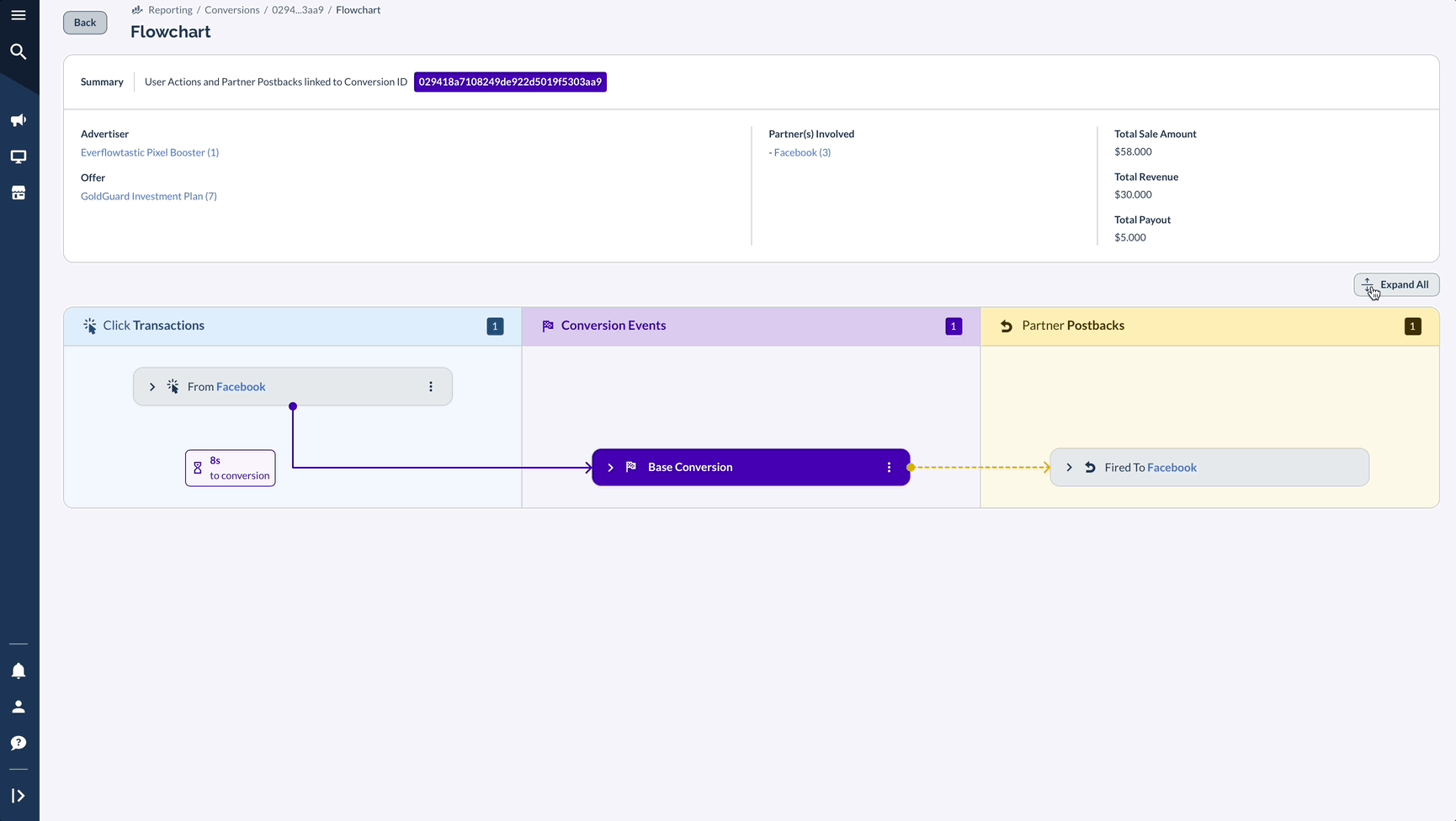
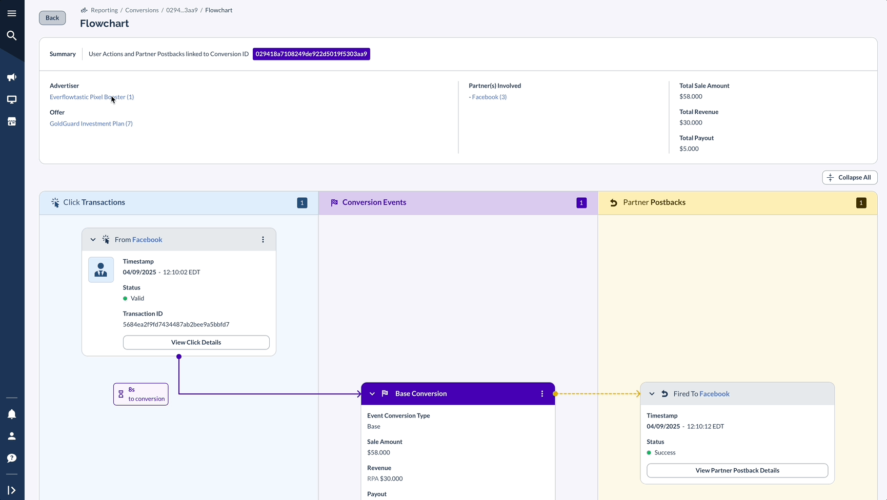
What You'll See In The Flowchart
Imagine your customer's journey as an Olympic swimming relay race across three distinct swim lanes. Each lane represents a crucial part of the Conversion story, with your customer as the swimmer moving through each stage with precision and purpose.
The flowchart divides into three main swim lanes, each containing vital information for tracking your customer's journey:
Source/Partner Information (Left Swim Lane)
Conversion Events (Middle Swim Lane)
Partner Postbacks (Right Swim Lane)
Just as a swimming coach analyzes each stroke and turn in the pool, you can observe how your customers navigate through each lane.
Watch for smooth transitions between swim lanes or identify where they might be struggling to complete their journey. The visual representation makes it easy to spot both the champions who glide effortlessly through your Conversion process and those who might need additional support to reach the finish line.
What Else Can You Click In The Flowchart
Don’t skip over the Summary box — it’s more than just a header.
At the top of every Flowchart, you’ll see a Summary section showing the Advertiser, Offer, Partner(s) Involved, and key data (Sale Amount, Revenue, Payout). But here's the useful part: most of these elements are clickable.
In the GIF below:
- Clicking the Offer takes you directly to that Offer’s Details page and hovering will give you some quick facts
- Clicking the Advertiser opens their full profile, while hovering over it gives you a quick Overview
- Hovering over Partners gives you a quick Partner Overview and Stats and clicking on one of the Partners opens Partner's Details page
Key Benefits of Using Flowcharts
Fraud Detection for Networks
Flowcharts make suspicious patterns immediately visible to Networks:
Example: When reviewing a gaming app campaign, you notice conversions occurring at identical intervals from the same IP address. This pattern of Click spoofing is much easier to detect with the visual timeline that Flowchart provides.
Multi-Touch Attribution for E-Commerce
For e-commerce businesses, understanding the complete customer journey is crucial:
Example: A high-value purchase journey might include:
- Initial discovery through Facebook ad
- Product page visit
- Cart abandonment
- Return via TikTok Influencer
- Final purchase
The Flowchart displays this entire path with precise timing, helping you optimize your retargeting window and attribute credit appropriately across channels. In other words, you can see the multi-touch attribution since several Partners, including Meta and an Influencer were involved in closing this Conversion. The question is: Who gets the credit?
User Behavior Analysis
Identify where and why users drop off:
Example: A subscription service notices trial Conversions dropping. Through Flowchart visualization, they discover that some users abandon during a specific signup step, with timestamps showing consistent delays—revealing a technical issue that was quickly fixed.
Debugging Tracking Implementation
When Partners report missing Conversions:
Example: An affiliate manager uses Flowchart to trace the problem. They can see Clicks registering correctly, but postbacks fail to trigger—quickly identifying a misconfigured postback URL causing the issue.
How to Get the Most From Flowcharts
- Establish benchmarks: Know your typical conversion times to quickly spot anomalies (using Click-to-Conversion time is also great for this since Flowchart is better on case by case basis)
- Monitor time intervals: Unusually fast or slow Conversions often indicate issues
- Compare source performance: Identify which traffic sources produce efficient journeys (again, case by case basis, but inspecting a few Meta vs Affiliate Flowcharts might give you a few additional ideas)
- Verify tracking integrity: Ensure data flows correctly from Partners to Everflow, etc.
- Investigate status changes: Use the History feature to understand why Conversions change status
By using the Flowcharts effectively, you gain unprecedented visibility into your individual marketing funnels, allowing you to optimize performance, identify issues before they impact revenue / tracking, and make data-driven decisions based on complete user journey analysis.


